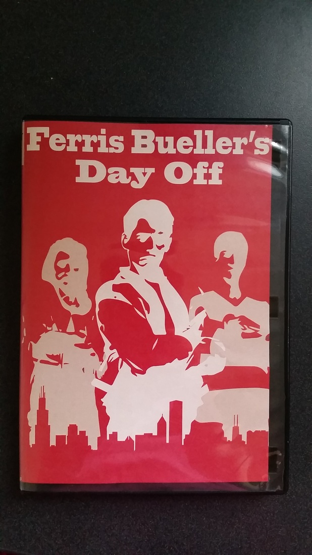
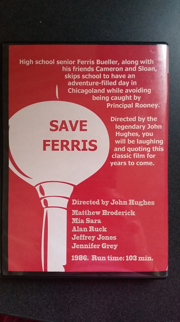
art 102 final: Movie poster and dvd case
|
|
art 102 digital movie postcards
For this assignment, we were to make postcards advertising our movies that we have been working with this semester.
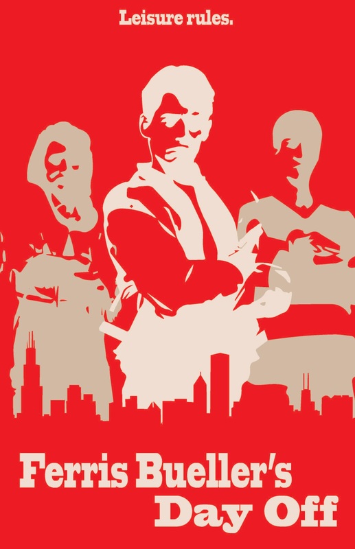
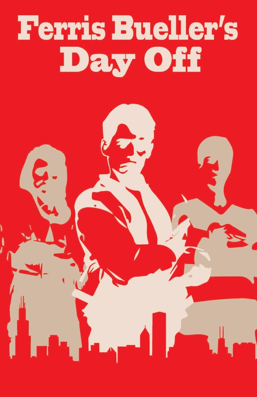
My movie is Ferris Bueller's Day Off. I chose to make three postcards because I had a few ideas going through my head for postcard designs.
My movie is Ferris Bueller's Day Off. I chose to make three postcards because I had a few ideas going through my head for postcard designs.
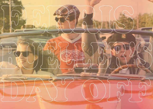
This postcard uses a filtered image to capture the spirit of the film
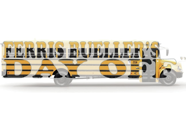
I experimented with clipping masks to have fun with the school bus image, focusing on how Ferris and his friends skip school in the film
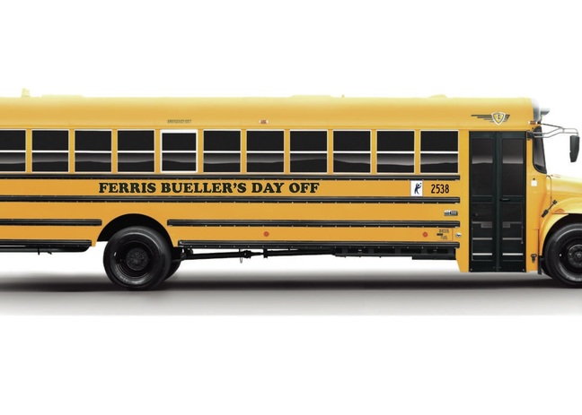
I again focused on the school bus idea but used text differently, making it more a part of the school bus image
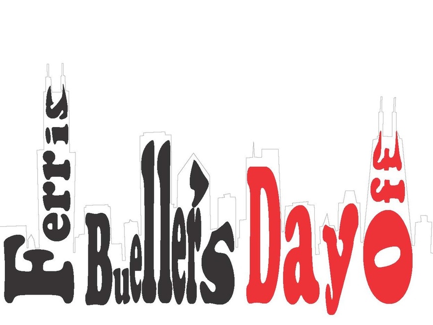
art 102 assignment 7: type as image
For assignment 7, we were to use typography and imagery to express meaning in the title of our films. My film is Ferris Bueller's Day Off, so I chose to shape the words into the Chicago skyline, since that is where Ferris and his friends felt free in the movie.
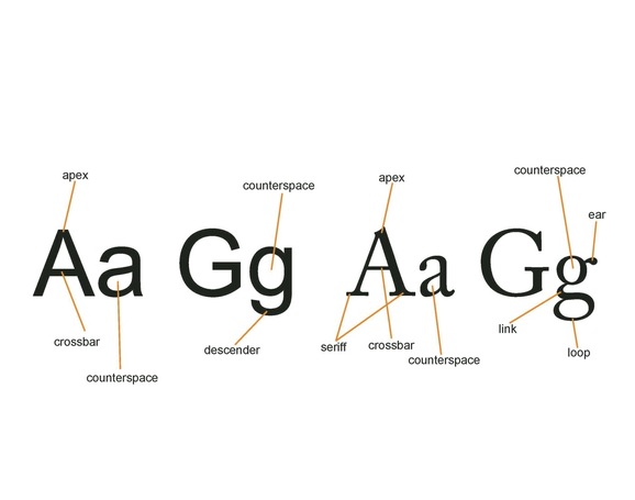
art 102 exercises 10 and 11: typography
For exercise 10, we were to take the letters A and G (in both upper and lower case) and label them with typography terms. This was to be done with fonts that did and didn't have serifs.
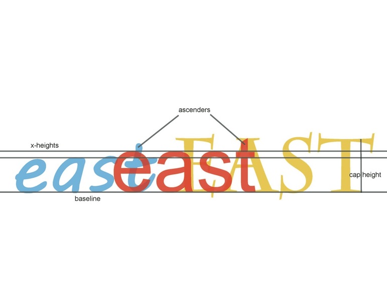
For the second part of exercise 10, we were to take a word of our choice and three fonts of our choice and layer them using the same baseline. After that, we were to label the parts of the letters and use this exercise to compare the different fonts. I chose to use the word "east".
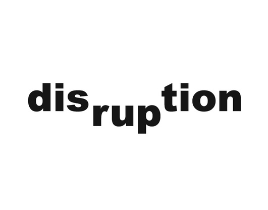
For exercise 11, we were to take two words from a selection and use typography to express the meaning of the words.
|

|
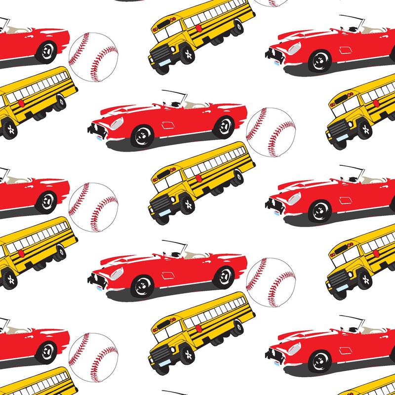
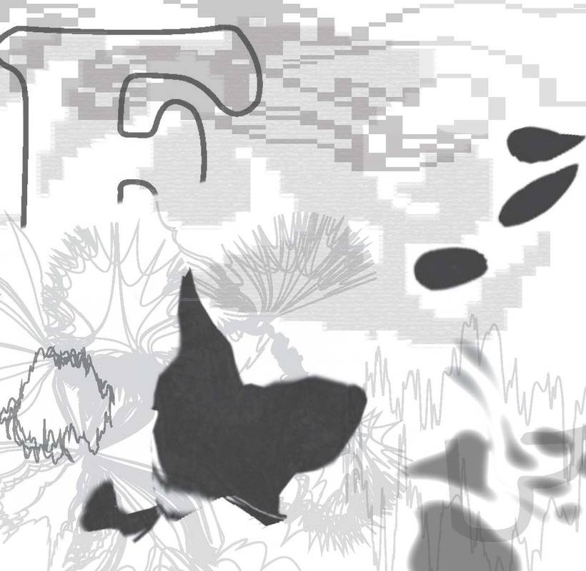
art 102 Color Pattern Swatch
For this assignment, we were to create a pattern swatch using images from the movie we have been working with in class. There was supposed to be a focus on the colors chosen and the tracing of our images in Adobe Illustrator.
The movie I have been working with is Ferris Bueller's Day Off, so I chose the baseball, Ferrari, and a school bus, focusing on warm, exciting/happy colors. I also varied the tracing style, especially between the school bus and Ferrari. For instance, the Ferrari looks freer with its lack of a bold outline, to show escape.
The movie I have been working with is Ferris Bueller's Day Off, so I chose the baseball, Ferrari, and a school bus, focusing on warm, exciting/happy colors. I also varied the tracing style, especially between the school bus and Ferrari. For instance, the Ferrari looks freer with its lack of a bold outline, to show escape.
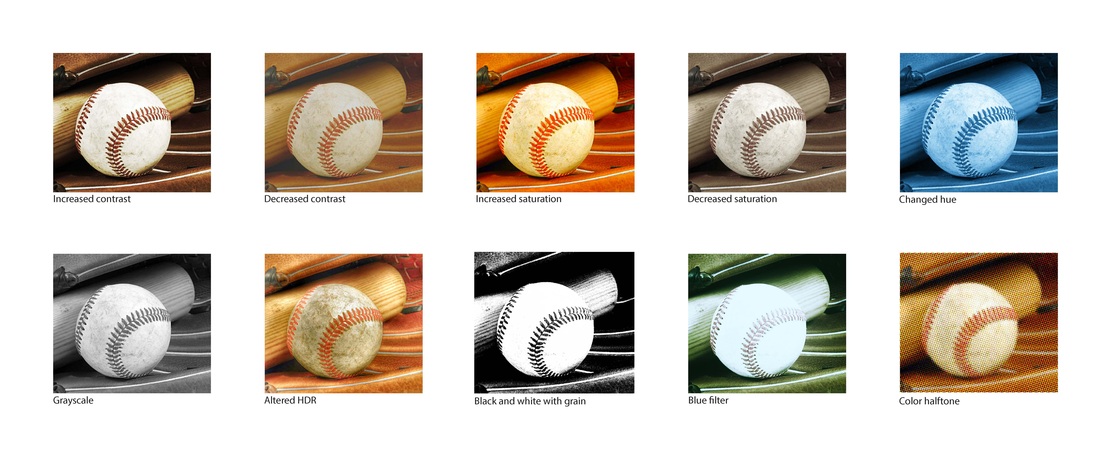
art 102 exercise 9: color
For this assignment, we were to edit a photo in a few different ways regarding color. Some of the changes were specified in the assignment, some of them were chosen.
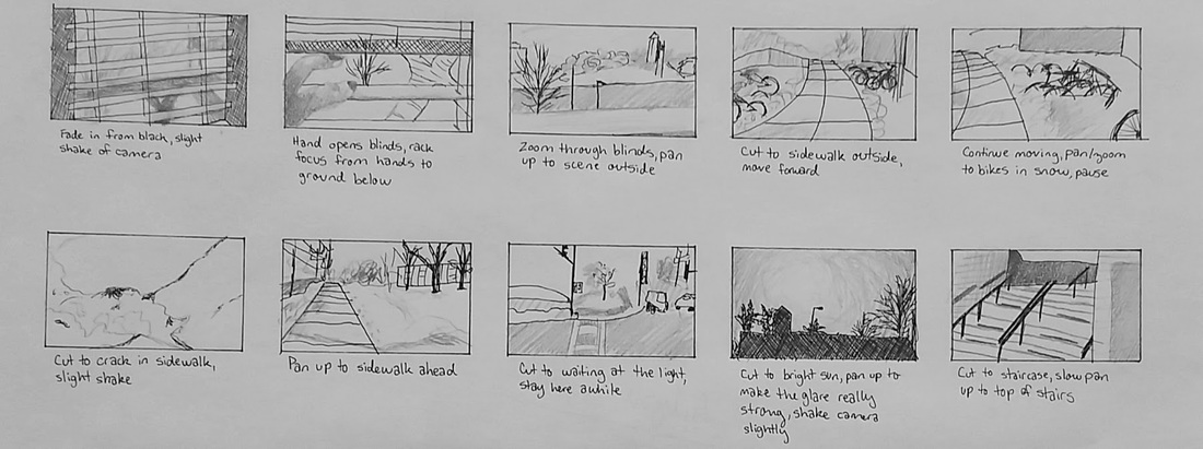
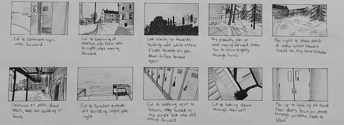
art 102 Assignment 6: Storyboard
For this assignment, we were to take photos of our walk to class (or somewhere else of our choice), and use them to create a storyboard or something similar. I chose to make a more traditional storyboard of my walk to class.
I took 26 photos but chose the 20 moments that I thought mattered most on my walk, mostly noting things I find interesting or challenging about my route. For the drawings, I used ink and graphite.
I took 26 photos but chose the 20 moments that I thought mattered most on my walk, mostly noting things I find interesting or challenging about my route. For the drawings, I used ink and graphite.
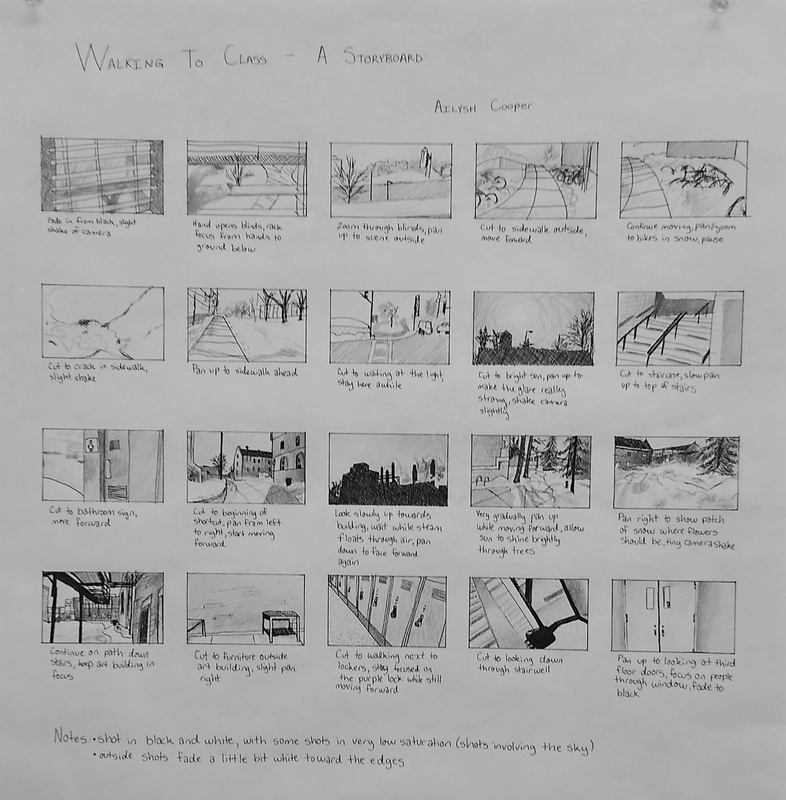
Detail of top
Detail of bottom
art 102 assignment 5: movie poster
For this assignment, we were to create a simple movie poster for the movie we have been basing our work on thus far in class (I chose Ferris Bueller's Day Off).
In my poster, I chose to emphasize the ideas of the three main characters skipping class and the pursuit by Rooney. The poster is based on previous designs I've done leading up to this assignment.
In my poster, I chose to emphasize the ideas of the three main characters skipping class and the pursuit by Rooney. The poster is based on previous designs I've done leading up to this assignment.
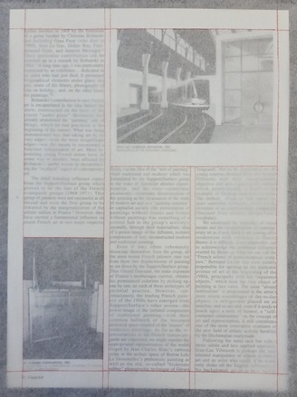
art 102 exercise 8: Use of the grid in magazine spreads
For this assignment, we were to find magazine spreads we found interesting and grid out how the spread was organized by drawing out the lines on tracing paper. We each looked at three spreads.
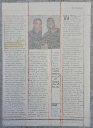
Three columns with emphasized quote
|
Three columns with images
|
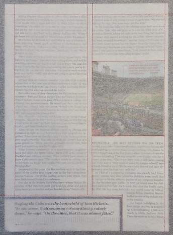
I was attracted to these pages because they are organized very simply but have images mixed in. These pages are not actually from the same spread but they are both organized on a three-column system. The page on the left has one smaller column between the second and third columns, which also drew me to the page.
This arrangement works for these pages because they are fairly text-heavy, but still have important images. The three columns of text on each page are not interrupted much with the images, allowing for a smooth reading experience. The emphasized quote on the left page works well in its current arrangement because it does not stop reading in the middle of a column, rather, it is set aside to create an interesting yet unobtrusive design for reading.
This arrangement works for these pages because they are fairly text-heavy, but still have important images. The three columns of text on each page are not interrupted much with the images, allowing for a smooth reading experience. The emphasized quote on the left page works well in its current arrangement because it does not stop reading in the middle of a column, rather, it is set aside to create an interesting yet unobtrusive design for reading.
Two-column system with emphasis box in corner
|
Two-column system with large image spanning the two columns
|
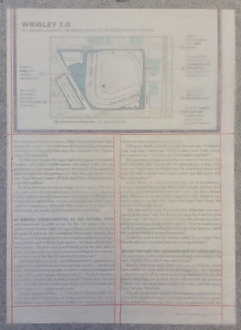
I was drawn to these because of the simple design and the emphasis on the diagram of Wrigley Field (I'm a Cubs fan). Normally a lot of text would not draw the eyes but because it was split so simply in two columns and had the emphasized corner as a break from the streamlined images, I found the design interesting.
The two-column design works particularly well for this spread because there is a lot of information, and two columns delivers it well. The images are streamlined so they are not distracting. The diagram is made large because there is a lot of information in it, but it is put in a block that spans both columns. This article, while not super serious, is also not the lightest reading, so a simple design is more desirable.
The two-column design works particularly well for this spread because there is a lot of information, and two columns delivers it well. The images are streamlined so they are not distracting. The diagram is made large because there is a lot of information in it, but it is put in a block that spans both columns. This article, while not super serious, is also not the lightest reading, so a simple design is more desirable.
|
|
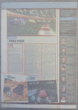
I was drawn to this spread because it seemed at once so chaotic and so organized. Because the pages are divided into four columns, the unusually thin columns of text are eye-catching. Overall the design of the spread is modular. The amount of images also drew me especially since they're streamlined at the top and diagonal at the bottom. The diagonal images especially interested me since the articles I had previously looked at were so simply and cleanly organized.
This organization works because it is a magazine about video games, so the publication would of course want to showcase the look of the games. The images that fit in the column margins create a neater look that lends itself more to reading and visual appeal. The diagonal images are less appealing visually in an article, although they do get attention because of the difference. The modular design lends itself to this publication because the readers are generally interested in technology, which often is organized in a more modular way.
This organization works because it is a magazine about video games, so the publication would of course want to showcase the look of the games. The images that fit in the column margins create a neater look that lends itself more to reading and visual appeal. The diagonal images are less appealing visually in an article, although they do get attention because of the difference. The modular design lends itself to this publication because the readers are generally interested in technology, which often is organized in a more modular way.
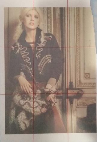
Photo demonstrating the rule of thirds
art 102 Assignment 4: Integrating letter tracing
For this assignment, we were to integrate our traced letters with our previous composition to create meaning.
art 102 exercises 4, 5, and 6: working with illustrator
For exercise four, we were to take our compositions from assignment one and zoom in on the compositions to see what kind of effect that had on the piece as a whole in terms of composition and meaning.
Original composition representing skipping school in Ferris Bueller's Day Off
|
Zoomed in
|
Zoomed really far in
|
Zooming in on the composition had a really interesting effect on the overall balance of the piece, and also stripped the piece of its meaning. It did, however, force a different perspective of viewing and could possibly make the piece more exciting to look at, depending on the viewer.
For exercise five, we were to explore the effects available in Adobe Illustrator by creating six different objects that we tampered with using the effects. Then we were supposed to put the objects together in a new composition that also combined and altered version of one of the compositions created in assignment one.
For this exercise, I chose to combine my objects with my "Pursuit" composition from assignment one since I thought that particular composition needed something. Although it was fun to explore the effects, I had a lot of trouble with the layers and had to start this project over partway through. It was frustrating, but I did learn more about Illustrator this way.
For this exercise, I chose to combine my objects with my "Pursuit" composition from assignment one since I thought that particular composition needed something. Although it was fun to explore the effects, I had a lot of trouble with the layers and had to start this project over partway through. It was frustrating, but I did learn more about Illustrator this way.
With the new objects and some alterations, the piece does look more interesting than the original composition, although I am not sure that the "pursuit" idea is conveyed very well.
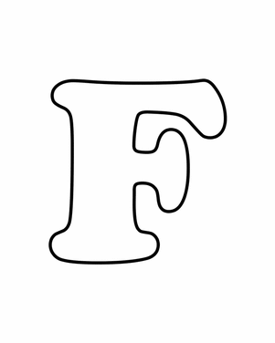
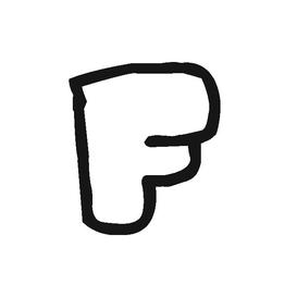
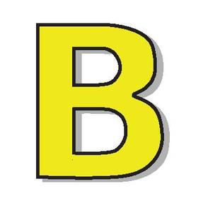
For exercise six, we were to search for images of letters that we found significant for the movies we chose at the beginning of the semester (I chose Ferris Bueller's Day Off) and learn to use the pen tool in Adobe Illustrator to trace them. I also chose to use the eyedropper to add color and help with letters that looked three-dimensional.
Here are a few of the letters I recreated:
Here are a few of the letters I recreated:

Original image
Original image
Original image
Original image
|
My tracing
My tracing
My tracing
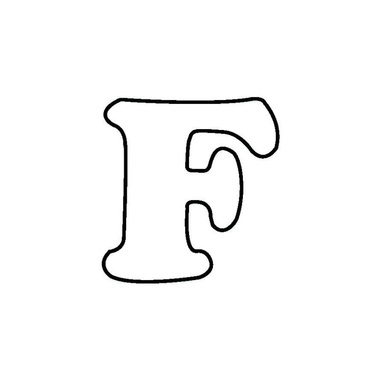
My tracing
|
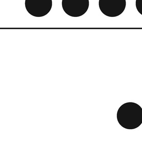
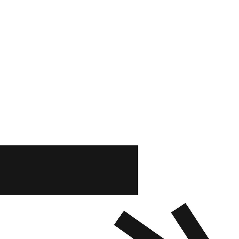
ART 102 Assignment 1: Dots, Lines and Planes to Show Action
For this assignment, we were to express words through the use of lines, planes, and dots on a square picture plane. The words were selected by watching a movie from a short list of titles given in class, and coming up with many words that show the essence of the film. We were then told to boil it down to the three words that best describe the movie.
I chose to watch Ferris Bueller's Day Off since it has always been a favorite of mine and thought it would result in more expressive pieces. While it was easy to come up with many words, I found it surprisingly difficult to boil the movie down to three words. The three that I eventually chose were "pursuit", "adventure", and "skipping".
I chose to watch Ferris Bueller's Day Off since it has always been a favorite of mine and thought it would result in more expressive pieces. While it was easy to come up with many words, I found it surprisingly difficult to boil the movie down to three words. The three that I eventually chose were "pursuit", "adventure", and "skipping".
Working out the best words and symbols
|
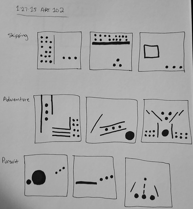
Hand-drawn thumbnails
|
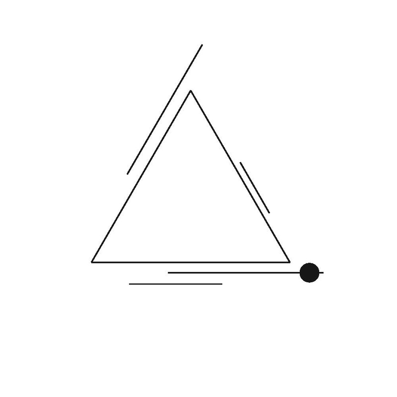
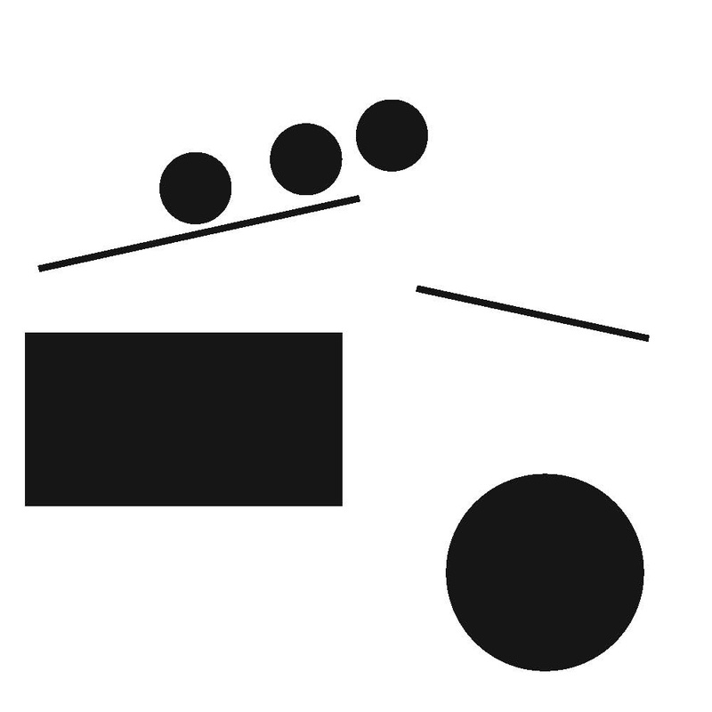
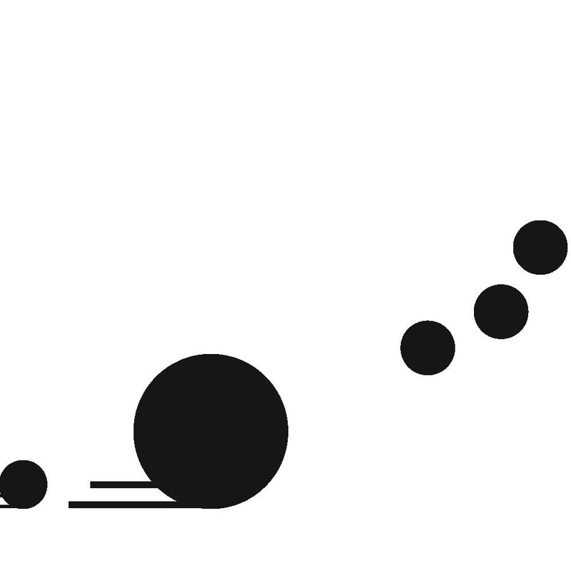
To prepare for this assignment, we did a few exercises in using simple lines, planes, and dots to show balance, tension, and rhythm. I also worked in my sketchbook a lot to gather my thoughts and see what actually works outside my head. As a class, we also took the time to discuss each other's ideas and give suggestions to more clearly express our words in an aesthetically pleasing way. After the exercises, discussions, and sketches, Adobe Illustrator was used to bring the ideas to life and allow me to play with the compositions until they worked.
Exercise to show balance
|
Exercise to show tension
|
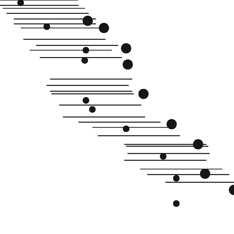
Exercise to show rhythm
|
Although I initially felt overly prepared for this assignment, once I was at the computer working I realized that the assignment was much more difficult than I anticipated. Simplicity was difficult to achieve while still being detailed and concise enough to express the exact word in mind. "Adventure" did not convey as clearly as I hoped, and I'm not sure that "Pursuit" is composed as well as it could be, but I am fairly happy with how "Skipping" turned out and people I asked got the idea very quickly when they looked at the finished piece.
"Adventure", showing the three main characters flying high over obstacles and the everyday life
"Pursuit", showing Rooney and Ferris' sister following Ferris, Cameron, and Sloan through the day

"Skipping", showing absence in the school building with the three main characters out on their own
ART 103 Final Assignment - "Instant Change"
For my ART 103 final, I was allowed to do whatever I wanted to do. I chose to focus on a memory for this project.
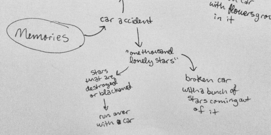
This final project was very exciting to me because it was so open and would allow me to express whatever I wanted to express, but at the same time it was difficult because I felt that, given so much freedom, I needed a really good idea behind my project. It took a lot of brainstorming to come up with something that would stick. Functional project ideas came to me first, but I felt that I had been focusing too much on the functionality of my art this semester and needed to do something really different and farther out of my comfort zone. My thought process turned to more abstract ideas, but none of them were important to me. Coming back to brainstorming fresh after a weekend, I decided to think about my memories and see what came to mind. I quickly remembered the car accident I was in this February, and thought about what I could say about the accident and its effects on me. I wanted to take a new, novel approach to a piece of artwork about a car accident and explore something unique to mine, so I thought about how I see the world differently after the event. The first thing I thought of was the song that was playing when I was in the accident – “Instant Crush”, by Daft Punk. The line that was playing was “One thousand lonely stars” at approximately 2:46 in the song, and before the accident it always made me think of a sky full of big, beautiful, golden-yellow five-pointed stars. After the accident, though, every time I hear that line I just think of the accident.
If you would like to hear the song, I've included it below. ↓
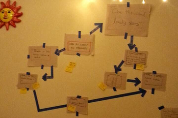
Planning out the project on my wall
|
Solidifying ideas in my sketchbook
|
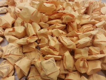
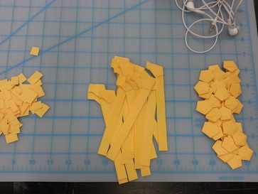
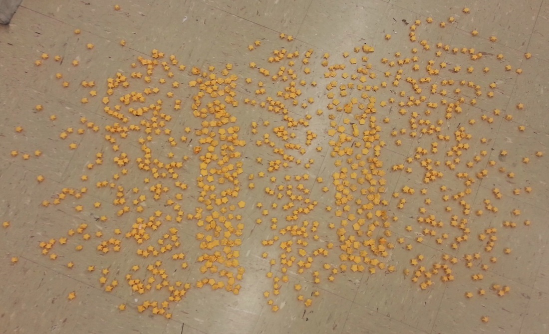
This, I felt, was an interesting idea to convey through art - how something beautiful can be changed in an instant after a negative experience. It was something that had been on my mind a lot and something not everyone can understand, so art would be an excellent way to show the feelings I have about the song now. I briefly considered a few various ideas, but ultimately went with an installation piece consisting of one thousand stars made of golden paper, hand-folded. It took many hours and lots of patience to fold all the stars, making sure that all of them looked good. Then I had them run over by a car on a rainy day to create tire tracks through the spread of pretty, clean stars. This shows how my mental image of beautiful stars is marred by the accident, and though it is very literal, I think it is effective in its simplicity. Some of the strength of my approach to the project, I feel, is in the tedious work of folding stars because, like learning to drive, I didn't really want to do the repetitive work but knew it would pay off in the end because I would learn and refine a new skill, but ultimately a dent was put in the work I had put into it.
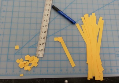
Starting to fold the stars from strips of cut paper
Run-over stars
|
Once I had made the pentagons (right), I puffed them into stars
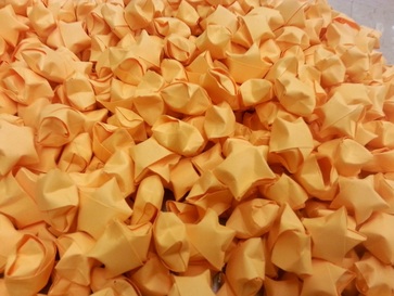
Clean, finished stars
|
This project really pushed me out of my comfort zone of functionality and geometric, exact shapes. Installation is also something I find really interesting, expressive, and emotional, and now I want to try more. This project really opened my eyes to what I can do when I try something new and I am happier with this project than anything else I have done this semester.
This is what it looked like installed in the classroom for the critique
* More and better photos of the piece will be posted when the snow outside melts.
ART 103 Assignment 6 continued: Classmate Interview
For this part of the assignment, I had to interview a classmate about the "Put a Bird on It" project and about her experience and thoughts on art.
I interviewed my ART 103 classmate, Erin, about the “Put a Bird on It” project and asked her a bit about her journey in art. Before interviewing Erin, I took a look at her website, which has lots of her artwork on it and shows her path in art and the different decisions she has made over time.
With regards to the “Put a Bird on It” project, I first asked Erin her thoughts on the “Put a Bird on It” video from Portlandia, which was shown to our class before starting the project. She felt that “those people were trying to make fun of…stereotypical fads in America”, so that is the main idea she put in her piece. Her work for that project shows that we in America are “numb” to actual things, like animals, and just like the physical representation of them. She chose to make her piece from metal and plastic tile because the cold, hard approach shows human cruelty toward the animals we use as decoration. I asked Erin if kitschy symbols can be taken seriously, and she said that really it depends on the setting and consumer. She believes that there is a big difference, depending on if a symbol is meant to be trendy versus taken seriously. Context is the main idea to understanding. This is linked to the difference between high and low art, which Erin says changes from person to person. Crafts, which are generally thought of as lower than art, are considered another type of art by Erin, “like painting is”. Ornamentation of objects are generally “where we get confused on whether it’s art or not”, because of the imaginary line between commercial art and fine art.
After discussing her recent bird project, I asked her about art in general in her life. Erin did not have much experience in art until high school, where she felt somewhat inadequate. However, she developed her skills and began to really shine at painting. Her brain, she feels, is now wired for two-dimensional work, so being in a 3D foundations class is challenging the way she thinks. Erin does not like to make controversial art and wants people to easily understand her work, so the symbolism she uses is quite literal. One of her favorite symbolic elements in her work is color. She uses the symbolism to explore things she feels are wrong in the world. Erin takes the things that bother her and put them in her work to bring attention to the issues and inspire people to make a change. Despite her work with various issues, Erin gets her inspiration from traveling, nature, and taking breaks from working. She also looks back and gathers inspiration from memories. Freedom, Erin believes, is possible as an artist if one does not give in to others and only does work one wants to make. Her teachers have given her lots of freedom to grow in and explore art, contributing to her success so far in college.
ART 103 Assignment 6: "Put a Bird on It"
For this assignment, our only guideline was to "Put a bird on it".
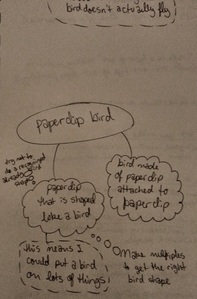
I wasn’t confused exactly when I started this assignment but I definitely wasn’t sure what to think. It seemed like some sort of really involved trick question to me but I decided to just roll with it and figure out how to creatively put birds on things. A lot of ideas bounced around in my head but none of them seemed really cool or meaningful until I thought about how the same bird could maybe be reused and put on lots of things. Birds travel a lot, and I thought my birds should travel too, to reflect the spirit of real birds. I also figured it would be nice if they were functional. This had me stumped for a while because I really liked the idea of traveling, functional birds but I couldn’t come up with a way that would work in an original way. Then the next day in English class I had a ton of papers to sort and no paper clips, which mildly annoyed me, and then I thought about paper clips and wonder how many people they get passed along to before they eventually get lost or something, and thought about their traveling nature. That’s when I came up with my idea to make bird-shaped paper clips, since birds and paper clips share the traveling nature and paper clips would make my birds functional.
I wasn’t confused exactly when I started this assignment but I definitely wasn’t sure what to think. It seemed like some sort of really involved trick question to me but I decided to just roll with it and figure out how to creatively put birds on things. A lot of ideas bounced around in my head but none of them seemed really cool or meaningful until I thought about how the same bird could maybe be reused and put on lots of things. Birds travel a lot, and I thought my birds should travel too, to reflect the spirit of real birds. I also figured it would be nice if they were functional. This had me stumped for a while because I really liked the idea of traveling, functional birds but I couldn’t come up with a way that would work in an original way. Then the next day in English class I had a ton of papers to sort and no paper clips, which mildly annoyed me, and then I thought about paper clips and wonder how many people they get passed along to before they eventually get lost or something, and thought about their traveling nature. That’s when I came up with my idea to make bird-shaped paper clips, since birds and paper clips share the traveling nature and paper clips would make my birds functional.
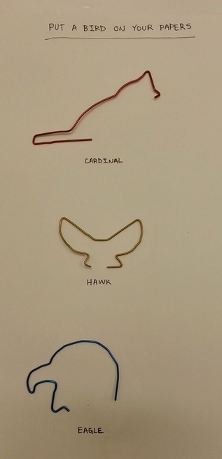
It was hard to really plan the making of the bird paper clips so I just dove in with a box of paper clips and some needle nose pliers. I made quite a few clips before I found three that really worked, both in the art sense and in actual functionality. I left the other attempts behind and held on to the best three, which are shaped like a cardinal, a hawk, and an eagle.
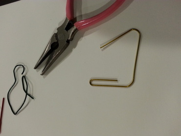
For some reason this idea is really holding on to me and I might make more clips in different shapes because it’s pretty cool, and maybe I’ll actually remember to take paper clips to English class with me if my clips are interesting.
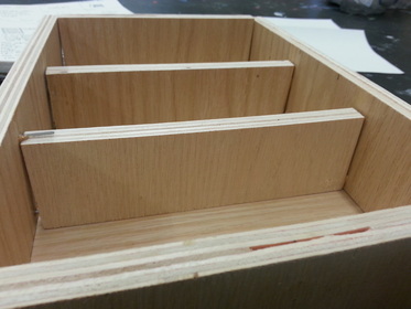
ART 103 Assignment 5: "Think Outside the Toolbox"
For this assignment, I had to make a toolbox for tools that are important in my life.
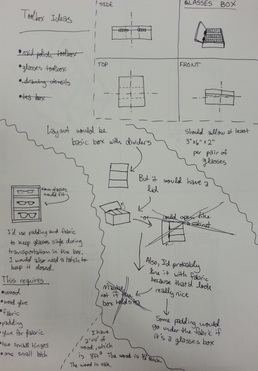
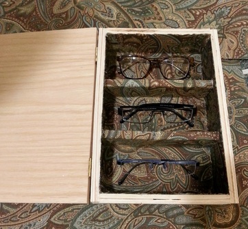
For this project, I took extra time in planning to make sure I didn’t do something someone else has probably done for this project in the past, plus I wanted to make something that actually has meaning for me. My first thoughts were ideas like making a toolbox for my art supplies, but I was sure that’s probably been done before and a toolbox wouldn’t be practical for biking around campus. I knew I needed something I could use back in my room, something that would stay in place but still protect and organize my things. Walking through my day in my head, I remembered that my glasses are all in individual cases rolling around in a drawer, which doesn’t protect or organize them much. Also, what tools are more important to me than my glasses? Having good vision is very important to me as an artist, and my glasses should be kept in clean condition in a nice box.
For this project, I took extra time in planning to make sure I didn’t do something someone else has probably done for this project in the past, plus I wanted to make something that actually has meaning for me. My first thoughts were ideas like making a toolbox for my art supplies, but I was sure that’s probably been done before and a toolbox wouldn’t be practical for biking around campus. I knew I needed something I could use back in my room, something that would stay in place but still protect and organize my things. Walking through my day in my head, I remembered that my glasses are all in individual cases rolling around in a drawer, which doesn’t protect or organize them much. Also, what tools are more important to me than my glasses? Having good vision is very important to me as an artist, and my glasses should be kept in clean condition in a nice box.
|
|
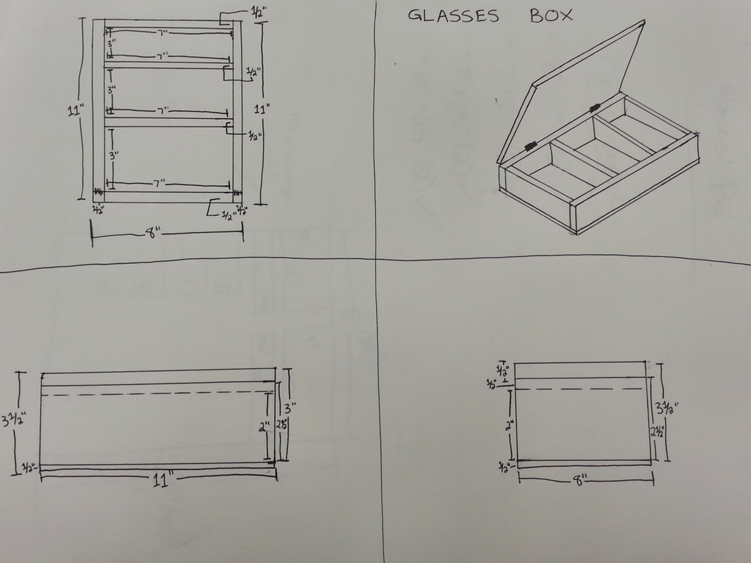
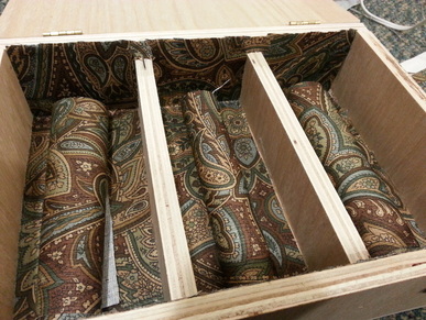
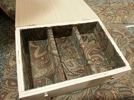
I wanted to make a box with a simple, practical design. Instead of doing something elaborate and artsy, I focused on the glasses and what they need. Glasses need padding and separation so they don’t get tangled on things, so I made plans for a simple box divided in three parts with nice fabric and padding lining the inside. After adding hinges and latches so the box cannot fall open and dump the glasses out, my glasses now have a new home.
|
|
I’m considering going back to it and staining/polishing the outside of the box, but I’m not sure if that could have negative effects on the glasses, hinges/latches, or fabric.
|
|
ART 103 Assignment 4: Techno-Bling Project
For this assignment, I had to design five pieces of body adornment or tech accessories using a 3D modeling program.
It was rather difficult to come up with ideas for this project because it’s hard for me to do projects on the computer. I’m really hands on and generally know my strengths, weaknesses, and limits, but on Tinkercad I had no sense of what I could do since I had no experience with the program. I quickly learned what I could do with basic shapes though, and from there I just let ideas flow. To have some kind of theme I chose to make rings by picking a shape and seeing where it took me.
It was rather difficult to come up with ideas for this project because it’s hard for me to do projects on the computer. I’m really hands on and generally know my strengths, weaknesses, and limits, but on Tinkercad I had no sense of what I could do since I had no experience with the program. I quickly learned what I could do with basic shapes though, and from there I just let ideas flow. To have some kind of theme I chose to make rings by picking a shape and seeing where it took me.
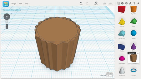
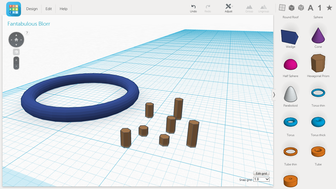
I organized my thoughts by thinking of the rings from different angles
For the first ring I chose to make an arrow because I saw the triangles and the idea just came to me. For the other rings I started by making a green band and then added shapes, for instance, I picked out a basic ring form and then found a hexagonal prism, which made me think of Giant’s Causeway in Ireland. From there I repeated the form over the front of the band. I formed the band of another, brown ring using many hexagonal prisms with a hole through them, for another, a flattened blue sphere to form a band that turned into a simplified UFO. One of my rings that I’ve nicknamed the French Fry ring was made by repeating the letters X and V over the band to make bars that stick out.
Reese's ring in progress
|
Giant's Causeway ring in progress
|
It was kind of fun to see what I could do with basic shapes rather than one elaborate form. After the initial challenge of learning how to use Tinkercad, the project went very smoothly.
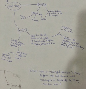
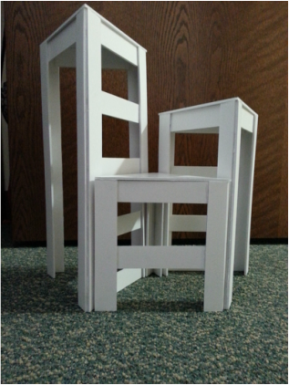
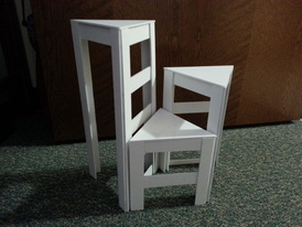
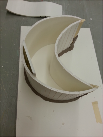
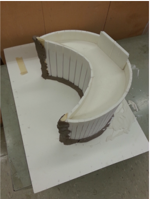
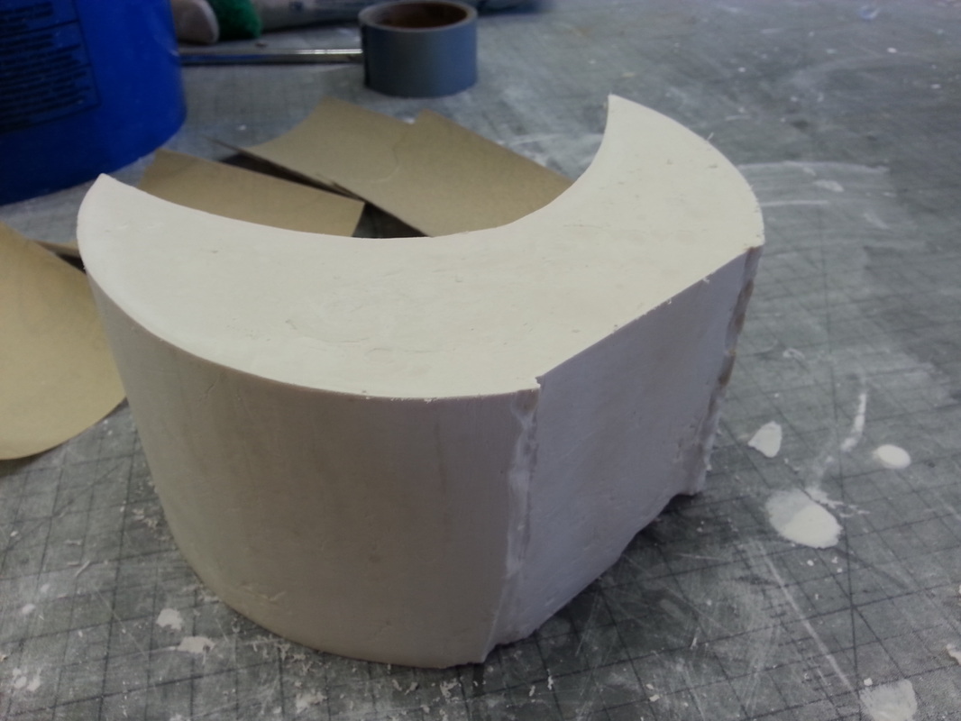
ART 103 Assignment 3: Public Art Project
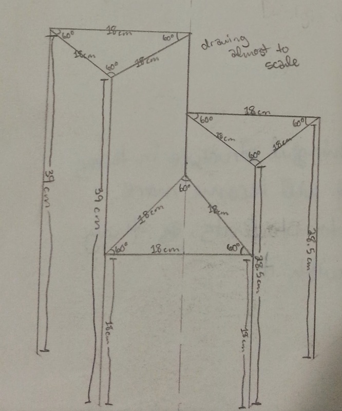
For this assignment, I had to design a public sculpture for the Northern Illinois University campus and make a to-scale foam core maquette.
I had a relatively easy time coming up with ideas for this project, but it was hard for me to figure out exactly what I wanted out of the sculpture. At first I was coming up with ideas that incorporated more than just the main form, such as interaction with plants and water, but then I decided to focus on just the form and making it very strong. Many ideas occurred to me about how the sculpture could be used for shelter, hanging out with friends, and relaxing, but I realized what would be best is a sculpture that could suit these purposes while also being something students could interact with so it would be more meaningful to them. This would be layered with the meaning already existing in the form to make a truly special sculpture. Because the sculpture would be displayed in a public place, it is important for it to have something special in its meaning and how it can generate its own meaning beyond the meaning I as the artist have already included.
I had a relatively easy time coming up with ideas for this project, but it was hard for me to figure out exactly what I wanted out of the sculpture. At first I was coming up with ideas that incorporated more than just the main form, such as interaction with plants and water, but then I decided to focus on just the form and making it very strong. Many ideas occurred to me about how the sculpture could be used for shelter, hanging out with friends, and relaxing, but I realized what would be best is a sculpture that could suit these purposes while also being something students could interact with so it would be more meaningful to them. This would be layered with the meaning already existing in the form to make a truly special sculpture. Because the sculpture would be displayed in a public place, it is important for it to have something special in its meaning and how it can generate its own meaning beyond the meaning I as the artist have already included.
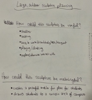
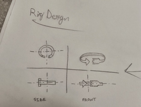
Planning with questions
|
Organizing my thoughts
|
Drawing some ideas
|
Working out details and measurements
|
Kind-of-to-scale drawing
|
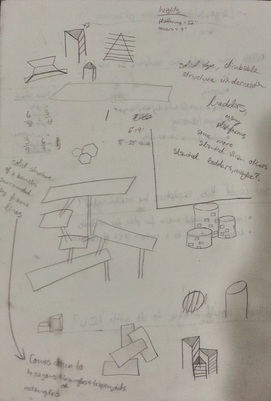
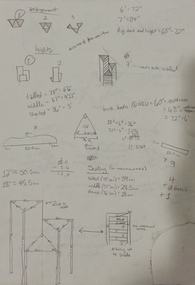
Many ideas came to me for how to make a sculpture that would work with all the purposes I thought of, including platforms connected in various ways, benches, and towers. I liked the idea of creating towers because I liked the idea of college students having to climb higher and higher and see the world from a different point of view, and then I put ladder-like rungs on each triangular tower to attract more students to the sculpture for climbing and the like. This meant that I had to do some research to see what a safe height would be for the sculpture considering that people will probably climb on it. Initially I did not like the height limitation I had made for myself, but I ultimately decided that more people will probably climb on a sculpture that is short enough to be safe to climb.
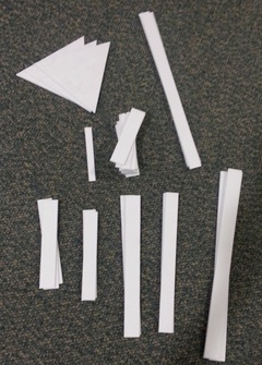
I cut out all the pieces before assembling them
|
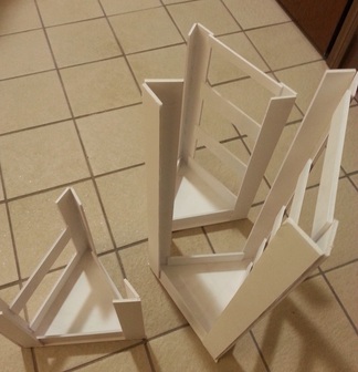
The three parts had to cool upside-down after gluing
|
I think I would like the sculpture to be white, but it might not stay white very long with weather and people climbing on it. However, I think that white would stand out well against the mostly green backdrop of East Lagoon and would not get hot as quickly as other sculptures (this is important because students can sit on the sculpture). The lagoon seems like a good place for the sculpture because it’s a beautiful area that could use more visitors and the sculpture would be a nice contrast with the water. The sculpture would be placed within twenty or so feet of the water so students have a nice view from the top of the sculpture, however, it would not be so close to the water that students use it as a diving board.
|
Better photos will be coming soon!
|
|
ART 103 Assignment 2: Design From Line
For this assignment, I had to pick an object and make a support structure using contour lines.
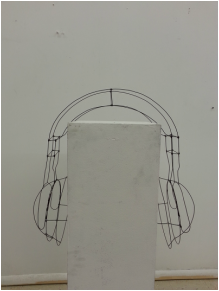
For this project, I had more trouble with ideas. Although I found plenty of objects around my room that could have made cool sculpture skeletons, many of them were things I figured had already been done or were too simple. I also wanted my work to at least have a little bit of meaning, at least to me, and I could not find anything that fit the caliber what I wanted as a final product. Then, walking around to classes, I noticed myself staring at people’s headphones – people wear headphones that are so big, colorful, and patterned that one cannot help but notice them, especially when people blast their music so loudly. That’s how I got my idea for the sculpture: taking my headphones to the next level of conspicuousness.
For this project, I had more trouble with ideas. Although I found plenty of objects around my room that could have made cool sculpture skeletons, many of them were things I figured had already been done or were too simple. I also wanted my work to at least have a little bit of meaning, at least to me, and I could not find anything that fit the caliber what I wanted as a final product. Then, walking around to classes, I noticed myself staring at people’s headphones – people wear headphones that are so big, colorful, and patterned that one cannot help but notice them, especially when people blast their music so loudly. That’s how I got my idea for the sculpture: taking my headphones to the next level of conspicuousness.
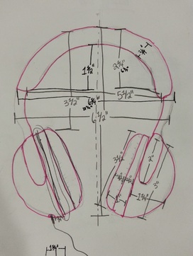
Initial measurements
|
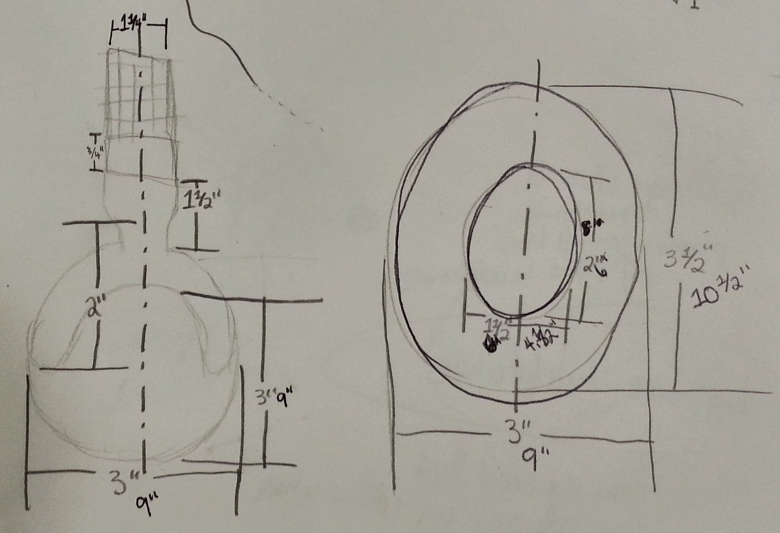
Additional measurements
|
I did this by scaling up my original headphones by three, but left the frame pretty bare to show off the simplicity of the headphones’ form. This made it rather difficult to keep stored without parts of the sculpture bending, so I do regret the decision a bit. I think I could have kept the simplicity by doubling up the wire and twisting it, but I was too far into the sculpture by the time I realized that solution. I never regretted my decision to build headphones though, the idea really stuck with me once I had it and I thought it was a funny idea to build even bigger headphones than the ones I see around campus. At one point I thought about painting the headphones, but I think I will leave them the color of the wire because I like how it forces more attention to the form than a bright color.
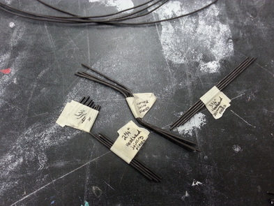
I made many pieces and labelled them before assembly
|
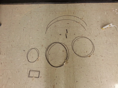
Larger labelled pieces
|
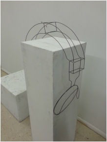
After most of the assembly
|
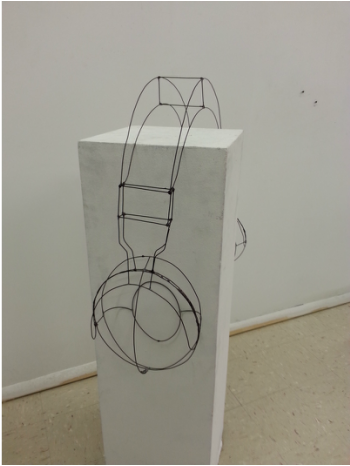
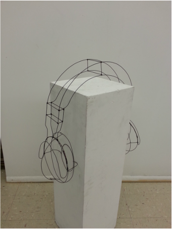
To display the piece, I would put it over a pedestal in bright lighting all around. Putting the sculpture over a pedestal would leave a vague idea of headphones sitting on someone’s head, plus it’s a necessity because if I leave the sculpture on its side for too long, I think it would get distorted because the hot glue isn’t very strong. The bright lighting would be necessary for this sculpture because the wire is so thin and dark that if there were shadows, it might blend in and be less defined.
|
|
Finished piece
|
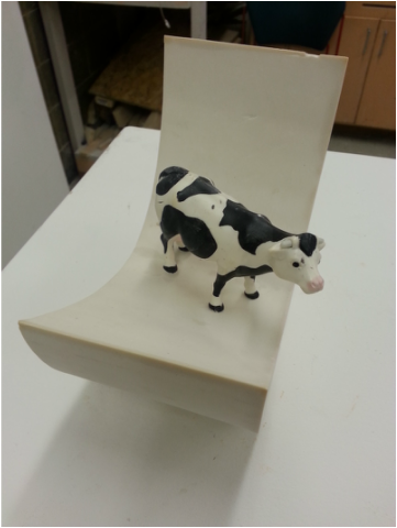
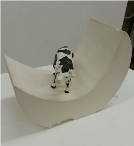
ART 103 Assignment 1: Object Interaction
For this assignment, I had to pick an object and create a plaster form that interacts with my object.
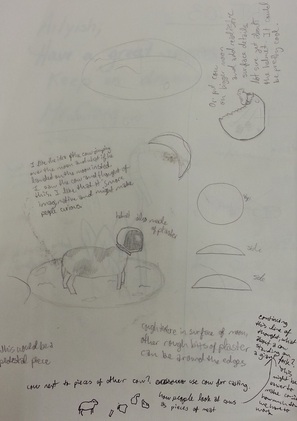
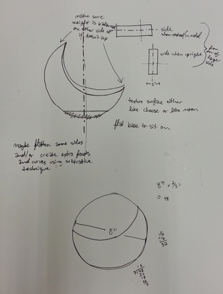
I had no shortage of ideas for this project when I first started. I couldn’t decide between two objects from my house – a plastic cow and a plastic parachute man. When working out ideas, my mind was split between the two objects, and it wasn’t until I came up with my final ideas for what I could do with the cow that I stopped considering the parachute man. My first ideas for the cow were darker; I was originally thinking of factory farming and bad things that cows go through, but when I make art I usually prefer to make something imaginative and whimsical, something that doesn’t make people sad. That’s when I started thinking about the nursery rhyme about a cow jumping over the moon, and I thought, “What if the cow didn’t make it? What if he got stuck there?” I had this funny picture in my head about this confused cow standing on the moon and knew that was it.
I had no shortage of ideas for this project when I first started. I couldn’t decide between two objects from my house – a plastic cow and a plastic parachute man. When working out ideas, my mind was split between the two objects, and it wasn’t until I came up with my final ideas for what I could do with the cow that I stopped considering the parachute man. My first ideas for the cow were darker; I was originally thinking of factory farming and bad things that cows go through, but when I make art I usually prefer to make something imaginative and whimsical, something that doesn’t make people sad. That’s when I started thinking about the nursery rhyme about a cow jumping over the moon, and I thought, “What if the cow didn’t make it? What if he got stuck there?” I had this funny picture in my head about this confused cow standing on the moon and knew that was it.
Some of my first ideas
|
Final ideas
|
I made some changes from my original idea to make it something smooth and with sharper corners and edges, which I think puts the focus more on the cow and makes the project more successful. I did put a little bit of rough texture at the bottom of the moon though so that it was more expressive and didn’t look so sterile. A lot of ideas bounced around in my head while I was making the project, but ultimately I stuck with my original goal for the project because I think it was a little more thought-out (being too spontaneous with plaster, I thought, could lead to messy results). This is one of my first projects that actually has a story behind it, and I like having a solid idea. I think going forward I am going to use developed ideas when I make sculptures because it will make me put more thought into what I’m doing.
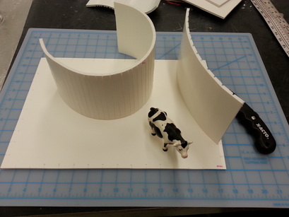
Making the mold
|
Assembled mold before pouring the plaster
|
Just after pouring the plaster
|
Just after coming out of the mold
|
To display the sculpture, I would make it a pedestal piece with dramatic lighting that comes in mostly from one side, that way when people walk around the sculpture, it will look somewhat like the different phases of the moon. This would be a cool but not too distracting effect to make the sculpture have more visual impact.
|
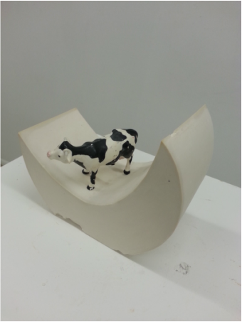
Finished project
|